Overview:
When customers are shopping in store, they want to know whether certain products are stocked, and be guided to the locations of these products in the store.
Our goal was to test two hypotheses:
Customer Impact: If we can provide customers with an XR experience that allows them to find out and be guided to products, customers will save time in their trip and we can reduce customer frustration.
Business impact: If we can reduce customer frustration and/or increase customer confidence in being able to find products, they will be less likely to abandon items they wish to buy leading to increased sales.
Our measure of success was customer satisfaction with in-store user testing. Specifically, we wanted to increase the confidence that they will be able to find where products are in the store.
Design process was highly iterative and concentrated within the team. We performed in-store User Testing monthly and internal user tests as often as possible, allowing us to achieve a 90%+ customer satisfaction score throughout over 200 customer tests in-store.
Goal
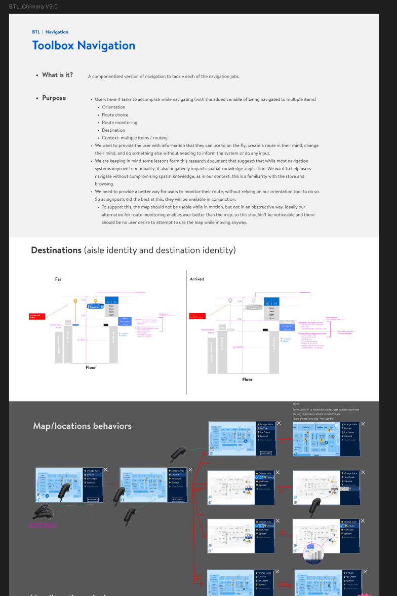
Create a navigation system for in-store use
Role
Lead UX Designer
Tools
Figma, ShapesXR, AE, PS, Unity
Timeline
April 2023 - November 2023
Locate
Locate was on of several consumer application prototypes developed to explore different use cases of AR for Walmart. The suite included "Help me choose" for product comparisons, "Help me find" for individual product, or other store services like the restroom or the helpdesk, and a replacement for the "Pick and pack" to optimize pathing and decrease training time for associate online shoppers new to the store.
These were prototypes meant to solve a user need, UI was not meant to be final.
Process
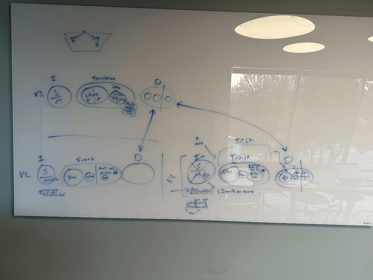
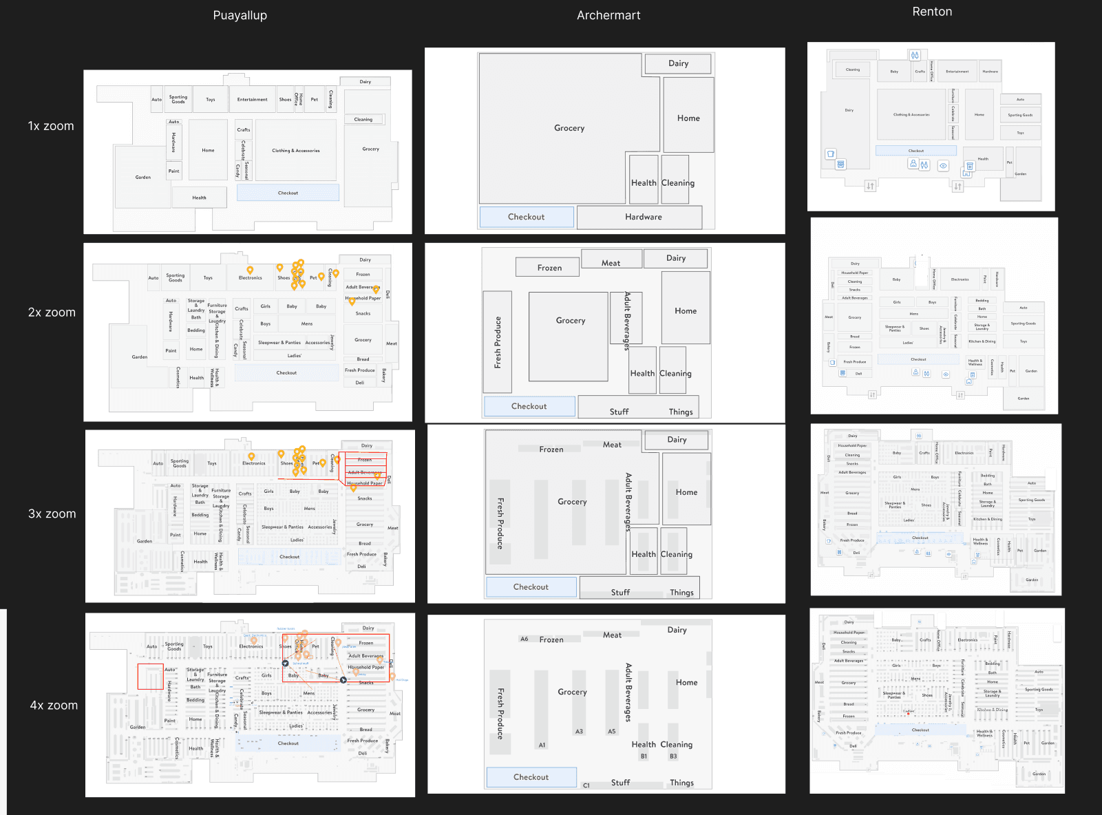
Whiteboard and storyboarding
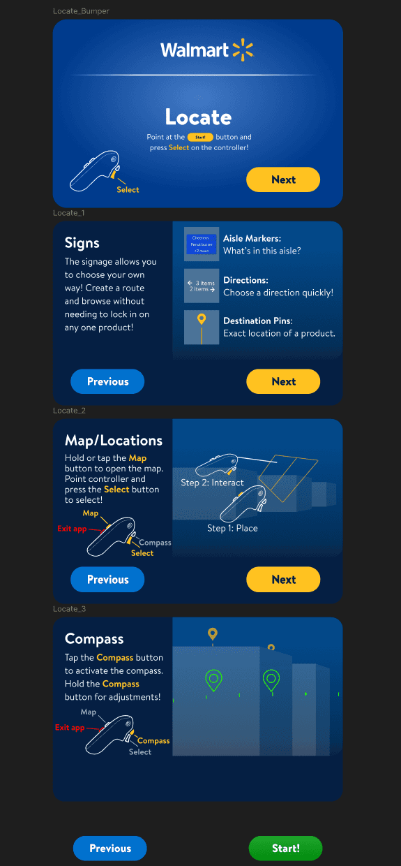
First time User Instructions
Towards the end, specifically for executive demos we realized we needed some form of tutorialization.
Either myself or QA were always with users in-store so we could hand-hold the whole time, but the presenters for executive demos were not as well versed in the moment-to-moment.
To solve for this, I worked with our engineers who created did the VFX and integration work to put it all together. I created instructions for all 4 of the "Back to school" projects to get this in.
Defining the new problem space is much harder than solving it. I learned that "Defining the problem is halfway to solving it."
In this case, counter-intuitivly, the problem was not "Getting them from point a to point b as fast as possible"
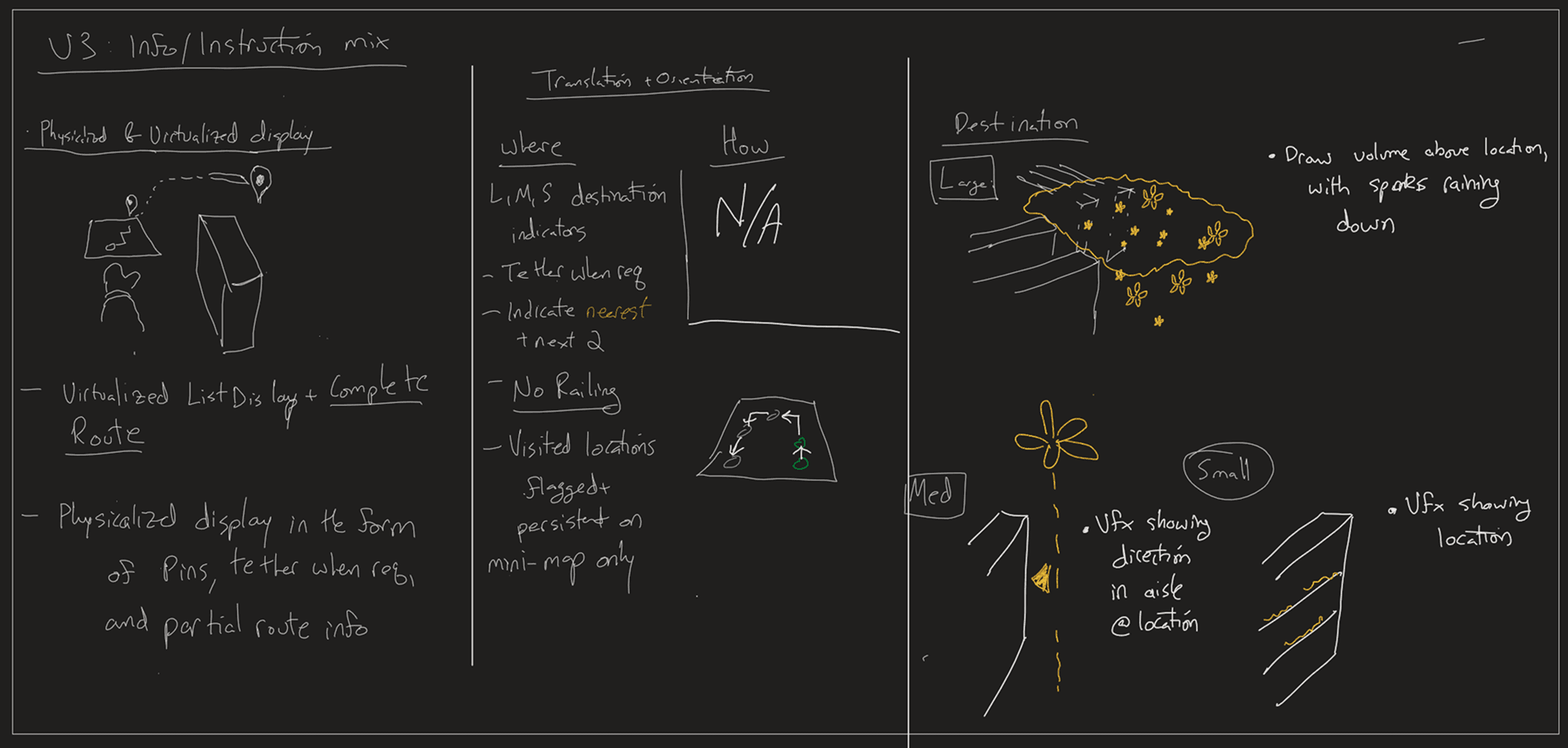
It may be that sometimes, but the real problem was how to consistintly keep the user engaged. When the user is following a line, it takes forever and is frustrating. Following a character means that they're blind to the destination. Giving the user handy clues about the next step, and the destination, at a physical glance rather than a contextual menu kept them engaged and comfortable the entire time while allowing for side activities or distractions without more cumbersome input.
In this case, less was very much way more.
Morgan Blair 2025
Seattle, Wa.